
October 9, 2026
9 Website Usability Issues That Cost You Leads
By Dylan Nelson, founder of Spry Growth
Website usability issues can turn paid clicks into lost calls. Learn what blocks visitors, how to find the friction, and what to fix first for more leads.
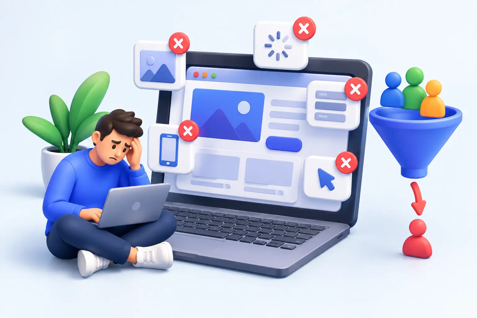
A homeowner clicks your Google Ad at 8:15 p.m. because their AC stopped cooling. They land on your site, cannot immediately tell whether you serve their area, and have to pinch-zoom to find a phone number. They leave and call the next contractor. That is how website usability issues become a revenue problem, not a design preference.
For a small or mid-sized business, a website has one job: help the right visitor take the next step. That may be a phone call, an appointment request, a quote form, an online booking, or a visit to your location. If visitors have to think too hard, hunt for basic information, or wait for the page to load, the website creates friction at the exact moment your marketing should be producing demand.
Why website usability issues cost more than you think
A usability problem does not only lose the visitor who encountered it. It also makes every marketing channel less efficient. A dental practice may pay for a click from Google Ads, rank in local search, or earn a referral from a happy patient. If the page makes scheduling difficult, the acquisition cost is wasted regardless of where the visitor came from.
This is why traffic numbers alone can be misleading. A site can receive plenty of visits while producing few calls or forms. The issue may not be your ad targeting, your search rankings, or the market. It may be that your best prospects reach the site and cannot quickly answer three practical questions: Is this business right for me? Do they serve my area or need? What should I do next?
On the Emerald Coast, timing can make that friction even more expensive. A vacation rental guest looking for an urgent service, a family searching for a last-minute restaurant reservation, or a visitor trying to book an activity is rarely going to research for long. During busy seasons, the business with the clearest path to action usually gets the booking.
1. Your site makes visitors figure out what you do
Business owners know their own services so well that they often assume the website explains them. But a headline such as “Quality You Can Trust” tells a new visitor almost nothing. It does not say whether you are an orthodontist, a roofing company, a property manager, or a law office.
Your first screen should plainly state the service, the customer or location you serve when relevant, and the action you want people to take. A plumber does not need clever language. “Emergency plumbing repair in Fort Walton Beach. Call now for fast service” is more useful than a broad brand statement.
This does not mean every page needs to sound identical. A hospitality business may lead with the experience, while a professional service may lead with a client problem. The standard is simple: a visitor should understand why they are on the page within a few seconds.
2. The next step is hard to find
A visible call to action is basic, but it is often handled poorly. Sites bury the phone number in the footer, use a generic “Contact Us” button without context, or ask visitors to complete a long form before they can ask a simple question.
Put the primary action near the top of the page and repeat it as visitors scroll. For a home service business, that may be a tap-to-call button on mobile and a short request-service form. For a med spa or fitness studio, it may be “Book a consultation” with an online scheduling option. A restaurant may need reservations, directions, and a view of the current menu.
The best action depends on how customers actually buy. If most qualified leads prefer to call, do not force them through a form. If your team cannot answer every incoming call during peak hours, offer a simple form or booking path as a reliable backup.
3. Mobile visitors get a second-class experience
For many local businesses, mobile is where high-intent searches happen. Someone standing outside a restaurant, dealing with a repair issue, or comparing nearby providers is using a phone. Yet many sites are still designed around the desktop version first.
Common mobile failures include tiny buttons, dense paragraphs, menus that are difficult to close, pop-ups that cover the page, and forms that require too much typing. Test your key pages on an actual phone, not only in a desktop browser preview. Can you call, request a quote, get directions, or make a booking with one hand and without zooming in?
Be especially careful with pop-ups. An email offer may help an ecommerce business build a list, but a pop-up that appears before a visitor can read the page can hurt a local service site. The trade-off is real. Use them only when the offer is valuable and the timing does not interrupt a high-intent visitor.
4. Page speed turns interest into abandonment
A slow site asks people to wait before they have any reason to trust you. Large images, autoplay video, overloaded page builders, third-party scripts, and unnecessary tracking tags are common causes.
Speed matters most on landing pages connected to paid ads. You paid to earn that visit. If the page loads slowly, the visitor may leave before seeing the offer, and you still pay for the click. This is one reason ad performance and website performance should be reviewed together.
Do not chase a perfect speed score at the expense of the page's purpose. A beautiful project gallery can matter for a custom builder, and high-quality room photography can matter for a hotel. The goal is to keep the media that helps a customer decide while removing the weight that does not.
5. Forms ask for too much, too soon
A quote form with twelve required fields feels like paperwork, especially on a phone. In most cases, you need a name, a phone number or email address, and enough information to route the inquiry. Everything else can be gathered later.
The exception is when additional detail materially improves the sales process. A remodeler may need project type and approximate budget to qualify a consultation. A medical office may need certain intake information, though the website should avoid collecting sensitive information in an unsecured general contact form.
Make the form's value clear. “Request an estimate” is better when visitors know what happens next: for example, that someone will call to discuss availability and scope. Also check that confirmation messages work. A submitted form that disappears into an inbox without a clear thank-you page creates uncertainty for the customer and makes conversion tracking harder.
6. Navigation reflects your organization, not customer needs
Internal departments and service categories are not always how customers think. A navigation menu with eight dropdowns may make sense to your team, but it slows down someone who simply needs help with a leaking water heater or wants to schedule a cleaning.
Start with the pages that support real decisions: core services, locations or service areas where relevant, proof of work, frequently asked questions, and a contact or booking page. Group related services in plain language. If a visitor cannot predict what they will find after clicking a menu item, rename it.
Search behavior can guide this work. Review the terms that generate calls and leads from Google Ads, Google Business Profile insights, and search console data. The language customers use should influence page names, headings, and navigation labels.
7. Important trust information is missing
People do not need a long company history before they contact you, but they do need reasons to feel comfortable taking the next step. Depending on the business, that could include service areas, staff credentials, project photos, operating hours, review highlights, financing information, or a clear explanation of your process.
Trust is especially important when the purchase is expensive, urgent, or personal. A visitor looking for a cosmetic dentist or a roof replacement is evaluating more than price. Clear proof and expectations reduce hesitation.
Avoid turning every page into a wall of badges and claims. A few specific, relevant trust signals placed near the decision point are more useful than a crowded page full of generic assurances.
8. Your landing page does not match the ad or search intent
A person who searches “emergency electrician near me” should not land on a broad homepage and start navigating. Send them to a page that addresses emergency electrical service, shows where you work, makes the phone number obvious, and explains what to expect.
The same principle applies to Meta Ads. If an ad promotes a summer teeth-whitening offer, the landing page should continue that exact conversation. Do not make people search through a general services page to find what they clicked for.
Message match improves usability because it respects the visitor's intent. It also makes performance easier to diagnose. When an ad, keyword, and landing page all have one clear purpose, you can see whether the issue is traffic quality, offer strength, or page conversion.
9. You cannot see where people get stuck
Some website usability issues are obvious. Others only show up in behavior data. If you do not track form submissions, phone calls, booked appointments, and key button clicks, you are making decisions from partial information.
Start with the actions that matter to revenue. Track which campaigns, pages, and search terms produce calls and leads. Then compare conversion rates by device. If mobile traffic is high but mobile leads are low, investigate the mobile experience before assuming the campaign is the problem.
Session recordings and heatmaps can also be useful when handled responsibly. They can reveal repeated clicks on non-clickable elements, visitors abandoning a form field, or people scrolling past a call to action. They are clues, not verdicts. Pair them with actual conversion data and feedback from the people answering phones or following up with leads.
Fix the friction closest to the sale first
Do not start with a full redesign because the site feels dated. Start with the pages that receive the most paid traffic, organic traffic, and branded searches. Then fix the barriers closest to conversion: unclear offer, weak mobile experience, hard-to-find calls to action, slow load time, and broken tracking.
A useful website is not the one with the most effects or the most pages. It is the one that makes it easy for a qualified customer to choose you. When the path from click to call or booking is clear, your ads, SEO, and referral traffic all have a better chance to produce the outcome that matters: more real customer opportunities.