
November 10, 2026
Website Design for Restaurants That Drives Orders
By Dylan Nelson, founder of Spry Growth
Website design for restaurants should make it easy to book a table, order online, call, and find you before hungry guests choose somewhere else instead.
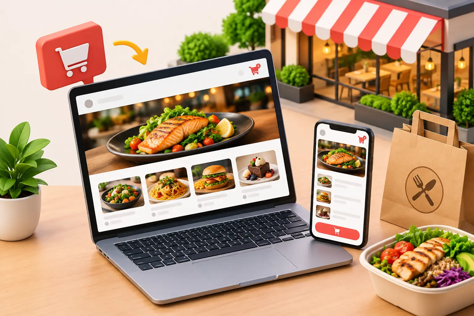
A restaurant website has a short window to work. Someone searches from a hotel room in Destin, checks menus on the way home from work, or looks for a dinner reservation on 30A. Within seconds, they need to know what you serve, where you are, whether you are open, and how to take the next step. Website design for restaurants is not about winning design awards. It is about turning that moment of intent into an order, reservation, phone call, or visit.
A beautiful site that buries the menu, loads slowly on a phone, or makes guests hunt for hours will lose business to the restaurant that makes the decision easier. The best restaurant websites operate like a capable host: clear, fast, helpful, and ready to seat the guest.
Start With the Conversion You Need Most
Every restaurant needs a website, but not every restaurant needs the same website. A quick-service lunch spot may care most about online orders and directions. A waterfront restaurant may need reservations, private-event inquiries, and an easy way for visitors to understand parking or seasonal hours. A catering company may need qualified event leads rather than individual table bookings.
That difference should shape the layout from the beginning. Too many sites try to give every action equal weight. The result is a crowded page where the visitor sees a gallery, a newsletter signup, three social icons, a story about the chef, and no obvious way to reserve a table.
Pick the primary action for each visitor path. For example, a dinner-focused restaurant might prioritize “Reserve a Table,” followed by “View Menu” and “Call.” A counter-service concept might lead with “Order Online,” then location and hours. The secondary actions still matter, but they should not compete with the action that produces revenue.
This is where a website becomes part of the customer acquisition system, not just a digital brochure. If Google Ads, local search, or social media sends people to the site, the page has one job: give those people a clear next move and make it easy to complete.
Restaurant Website Design Starts on Mobile
Most restaurant visits begin on a phone. That is especially true in tourism-heavy markets, where visitors are searching while they are already nearby. They are not studying your brand story at a desktop computer. They are deciding where to eat before the family gets impatient.
Mobile-first design means more than shrinking a desktop layout. The important information needs to appear immediately: restaurant name, location, current hours, primary action, and a simple path to the menu. Buttons need enough space to tap. Text needs to be readable without zooming. A guest should never need to pinch, scroll sideways, or open a PDF just to learn whether you serve brunch.
Speed matters just as much. Large uncompressed food photography, autoplay videos, and overloaded third-party widgets can make a site feel slow, even on a strong connection. Great visuals help restaurants sell, but they need to earn their weight. Use appetizing, current images where they support a decision, then optimize them so the page still loads quickly.
Put the essentials above the scroll
The first screen on a restaurant homepage should usually answer five questions: What is this place? What kind of food do you serve? Where are you? Are you open? What should I do next?
That does not require a bland design. It requires hierarchy. A sharp hero photo, a short positioning statement, and two clear buttons can do more than a full-screen video with a clever slogan. “Coastal Italian in Miramar Beach” tells a hungry visitor something useful. “An unforgettable culinary journey” does not.
Make the Menu Easy to Read and Easy to Find
For many guests, the menu is the website. If it is hidden under multiple menus, presented as a tiny PDF, or outdated, the site is creating friction at the exact point where customers decide whether to visit.
An HTML menu page is often the strongest choice because it loads quickly, works well on mobile, can be updated without replacing a file, and gives search engines useful context about what you serve. A PDF can still be available for guests who want it, particularly for a wine list or catering package, but it should not be the only menu experience.
Use clear sections, prices, dietary labels where relevant, and current descriptions. If pricing changes frequently, build a process for keeping the menu current. Nothing damages trust faster than a guest arriving for an item or price that no longer exists.
Restaurants with multiple menus should make the distinctions obvious. Lunch, dinner, brunch, happy hour, kids, catering, and seasonal menus should not be lumped into one confusing page. A visitor should know exactly which menu applies now.
Give Guests a Frictionless Way to Book, Order, or Call
The reservation or ordering tool should feel like a natural extension of the site, even if it runs through a third-party platform. The handoff needs to be clear. If a guest taps “Order Online,” they should land directly in the ordering flow, not on a generic homepage where they must choose the location again.
For reservations, show the booking action in the header and repeat it where it makes sense on key pages. For online ordering, keep the button visible on mobile. For restaurants that rely heavily on calls, make the phone number tap-to-call and place it near the top of the page.
Private dining and catering deserve their own conversion path. These guests need different information: capacity, event types, sample menus, lead times, and a short inquiry form. A generic contact form usually creates low-quality submissions because it asks too little and gives the prospect no reason to share useful details.
Ask for the information your team needs to respond well, such as event date, estimated guest count, location, and preferred contact method. Keep it reasonable. A 15-field form will reduce inquiries, while a vague name-and-email form creates more back-and-forth for your staff.
Build Local Trust Before the Guest Arrives
Restaurants compete on confidence as much as cuisine. A guest who is unfamiliar with the area wants proof that the choice will work for their group, budget, and plans. Your website should remove practical uncertainty.
Include accurate address details, a map area, parking guidance when needed, hours by day, and holiday or seasonal updates. On the Emerald Coast, this can be especially valuable during busy visitor months, when traffic, beach access, and seasonal schedules affect dining plans. If reservations are recommended during spring break or summer, say so plainly.
Photos should reflect the current experience. Show the food, but also show the atmosphere customers are choosing: patio seating, views, bar service, family-friendly tables, or a polished dining room. A guest deciding on a date-night restaurant has different concerns from a family trying to find a casual lunch after the beach.
Reviews can help, but they should support the page rather than take it over. The strongest trust signals are usually the basics done well: a current menu, accurate hours, professional photography, clear policies, and a website that works without frustration.
Track What Produces Revenue, Not Just Website Visits
A restaurant site can look busy while failing commercially. Pageviews, time on site, and social likes are useful context, but they do not tell you whether marketing is producing customers.
Track the actions that indicate real intent: reservation starts and completed bookings where possible, online-order clicks, phone calls, catering inquiries, direction requests, and contact submissions. If you run Google Ads or Meta Ads, use separate landing experiences or clear attribution so you can see which campaigns drive those actions.
There are limits. A guest may click for directions and never arrive, or make a reservation and cancel. But measured conversion actions are still far better than guessing. They show where the website is helping, where it is leaking demand, and which traffic sources deserve more investment.
For example, if a paid campaign sends plenty of visitors to a dinner page but few people reach the reservation tool, the problem may be the offer, the page speed, the booking link, or the message match. It is not automatically an ad problem. Spry Growth approaches this as one connected system because traffic quality and website conversion rate affect each other.
Common Restaurant Website Mistakes That Cost Bookings
The most expensive mistakes are usually ordinary ones. They create enough friction to send a ready-to-buy guest elsewhere.
- An outdated menu, incorrect hours, or an inactive online-order link makes the business look unreliable.
- A homepage with no clear booking, ordering, or call-to-action button forces visitors to figure out what to do.
- A slow site with oversized images loses mobile visitors before they see the menu.
- A generic contact page is used for catering and private events, even though those leads need a dedicated inquiry path.
- Marketing traffic is sent to the homepage instead of a page built for the campaign, location, or offer.
Fixing these issues is not glamorous, but it often produces a better return than adding more content or buying more clicks. First make sure the demand you already generate has a clear path to become a customer.
Design for the Real Decision, Not the Perfect Brand Presentation
A restaurant website should feel like your restaurant, but it also needs to respect the way people choose where to eat. Guests are busy. They are comparing options. They may be standing outside, coordinating a group, or trying to make a reservation before a popular time fills up.
The right design gives them confidence quickly, then gets out of the way. Keep the menu current. Keep the booking and ordering paths obvious. Track the actions that matter. When the site does those things well, it becomes a working part of your operation - not another marketing expense that looks good but leaves revenue on the table.